Friday, November 30, 2007

Christmas Wish List

In the fantasy world I occasionally occupy, these are some things I might put on my wish list.


Steven Webster Thorn Ring, at Neiman Marcus


Diamond in the Rough solitaire pendant with brown rough diamond, at Neiman Marcus


Malcolm Betts Natural Diamond Bangle, at Barneys


Marroni Sand Ring, at Barneys


Zoe Opaque Diamond Necklace, at Barneys


Cathy Waterman Kimono earrings, at Barneys

Thursday, November 29, 2007

Project Runway Episode Trois

Surely I'm not the only person who thought Heidi swiped her opening ensemble from the wardrobe department of the new JJ Abrams Star Trek film, am I?


This week's challenge was meant to get our intrepid designers out of their comfort zone, and what better way to do that than to force them to design menswear?! Who wants to design boring old suits for men? Few, apparently, as just about all of the remaining twelve designers started hyperventilating at the mere thought of it. That is, until they realized there would be hunky male models involved. Perk! Something for everyone!

"Except Kevin," you say, "the straight guy."

Ah, but did you catch his eyes light up when he saw that they were designing on-air wear for none other than Atiim Kiambu Barber, Tiki to you and me, retired NFL great and identical twin brother to current NFL player Rondé Barber? Football, man. Straight men looooove football. And yannow, I don't know why, because it's just about the gayest sport ever. Where else do you routinely hear about "penetration in the backfield," "eyeing the receiver," "pounding the tight end," and "incredible ball handling skills?" Not to mention the numerous times I've heard, "he's a fine-looking young [tight end/receiver/piece of ass]" mentioned by the play-by-play guys. Even crusty John Madden gets a tear in his eye (and possibly a tent pole in his pants) whenever he contemplates Cowboys' quarterback Tony Romo's dimples.

Don't the Barber brothers look darling with that cute little white doggie?
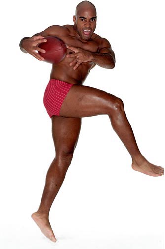
And tell me that you think this is just the most manly photo ever: Tiki in his stripy undies, looking "fierce."

Mr. Barber, now a correspondent for the Today show, asked the designers to create something that he could wear on air. Now, he's a pretty conservative guy who likes dark suits and perhaps a little texture and color in a shirt. And that's about it. Wouldn't "Neon" Deion Sanders have made for a more interesting challenge? Think of the orange or pink plaid pimp suits that could have gone down the runway! But, I digress.

Tiki also seemed to have issues with his ass and the fact that it sticks out. Judging by the photo above, I would say his thunder thighs could pose a wee problem as well.

Back at Parsons, the demoralized designers set to sketching ideas. The results were lots of blank paper accompanied by heavy sighing. The trip to Mood to purchase boring dark fabrics didn't lighten the mood at all. Heh. I can't blame them. Do you realize how much damn finishing/lining/detail work/pockets are involved in menswear? Have you noticed that former menswear designer Emmett McCarthy offers womens fashions in his NY boutique?

Now that we've hammered home the difficulties of this challenge, let's see the results.


Christian: I don't understand. Weird jacket over pajamas? Is the shirt collar asymmetrical, or was it attached wrong? Do the jacket pockets seem too low and shallow? It's Christian, so maybe that explains it.


Rami: On-air suitable perhaps if Tiki were doing commentary for the exciting world of golf, but I thought the jacket was extremely well-done, with lots of nice seaming details.


Sweet P: I'm surprised she survived this round. The collar was laughably huge and the sleeves were far too short. Michael Kors seemed to like the tie, so maybe that saved her neck. (God, I'm funny today.) I do think the pants turned out well, at least from my vantage point on the sofa.


Kit: She won kudos for making her jacket from fleece, giving it an edge while retaining a conservative spirit.


Victorya: She escaped without comment, but I think the jacket looked like part of a uniform for either an upscale bus boy or maybe a hospital orderly or bellhop. Or a hospital bellhop for a posh plastic surgery clinic in Beverly Hills. And since when is brown shoes with black a good thing? Or have they changed the fashion rules on me again?


Elisa: I was a bit disturbed that I liked this one so much. I love the vest, and also love the fact that nothing is turquoise or has torn rags hanging from it. No word if the pants are polymorphic, however.


Steven: This look straight out of a Ralph Lauren perfume ad featuring rich polo-playing boys who tuck in their sweaters and comb their hair funny. Not a bad ensemble for a skinny boy, but I think it would look a bit ridiculous on a somewhat squat and muscular guy like Tiki. Plus, tucking in the sweater would emphasize the butt, and that's a no-no in Barber-land.


Kevin: Now how is it that the straight man picks the loudest color of all? I think it's kinda great, and wish that he had been able to finish the vest with buttons. I'd love to see a finished jacket, too.


Jack: The winner, despite only having completed two pieces. Jack's tailoring was well done and the bias detail of the placket and pockets was noted by Michael Kors. Not the most interesting of designs overall, but compared to the sheer garbage that came down the runway, this was a clear winner.


Carmen: And speaking of garbage.... I expected Carmen to stick around for a few more weeks because she seemed like she had the potential for high drama at some point. But ack - the crotch on the pants was a problem, and the jacket was just not fitting the "I want to be able to wear it on-air" bill. Tiki's wife, who came on mid-show to critique the works in progress, likened it to a "Member's Only" jacket, that dated fad from the 80s. Ouch! And the blue fabric meant to stand in for a shirt more resembled a cleavage-revealing straight jacket.

Auf, baby, auf auf!

All-in-all, a more interesting challenge than the previous two, but we really need more sturm-und-drang this season, don't we?

Wednesday, November 28, 2007

Blushing

So, do you think I liked this stuff? This was a limited edition Paul et Joe blush that I picked up at Bergdorf Goodman last April, and I used it down to the rims. The only thing I didn't like about this product is that it came in a cardboard container. Good for recycling, sure, but I was afraid it would get crushed in my makeup bag, so I kept it in the box it came in.

I bought a replacement; not exactly the same color but it does come in a little plastic compact. My other go-to blush is Nars Orgasm.

What's your favorite brand and color of blusher?

Why So Secret, Elmo?


About time someone came out with an educational toy that teaches children how to masturbate.

Friday, November 23, 2007

Project Runway - Bring on the Tears

This week's challenge was to design an outfit for a pop culture fashion icon. When I heard that I thought, "gawd, not another Hilton sister!" But I was pleasantly surprised to find that it was an actual icon - none other than Carrie Bradshaw herself, Sarah Jessica Parker. Chris March, a.k.a. "Mr. Big," (heh, geddit?) got all verklempt at SJP's appearance; apparently Sex and the City was a big influence for him and the reason he moved to NY in the first place. Ah yes, the story of three stupid, yet highly fashionable, women making the same bad relationship mistakes over and over again is a big dose of life affirmation to many, I'm sure. (Psst...lay off the Twinkies, walk away from the TV, and get a life.)

Not only does Chris shed a few tears, we also see Ricky acting a little weepy. Twice. Drinking game, anyone? Seriously, why is everyone so emotional on reality TV? Little Ricky is reminding me of one of those gorram ugly Margaret Keene paintings of tearful big-eyed children. But with facial hair and a Choo Choo Charlie hat.

Sarah Jessica (does anyone else feel stupid calling someone by their first two names? Am I out of touch because I only go by one?) waved a magic carrot in front of the weepy/drooling/starstruck designers: the winning outfit may or may not be part of her Bitten line's Fall/Winter collection. Wow. May or may not. Promises promises!

Because SJP's line is on the very cheap inexpensive side, the budget for the project was $15. Each designer did a sketch that he or she presented to SJP who then picked her seven favorites. Yes, this was one of those annoying team challenges which usually serves up buckets of drama; unfortunately for us, most folks seemed to get along with their partners.

Elisa, Kit, Victorya, Marion, Ricky, Christian, and Rami were chosen as the favorites and they in turn had to choose partners. Elisa picked last and ended up with the leftover Sweet P. There seemed to be enticing potential trouble between the spacey and the down-to-earth, but despite "coming from different planets" they managed to live Tim Gunn's mantra of "make it work." Quel dommage.

In the end it was Christian and Marion who were called on the carpet for their fashion transgressions. And then we get more tears, this time from Carmen, when asked who on her team between herself and Christian should be auf'd. :::tipsily tosses back another shot of vodka:::

Here's what came down the runway:


Kit: Cute concept, nicely executed.


Ricky: Ack. Boring. The belt seems like an afterthought. It was smashing with those boots though. Love the boots! But...Tearful Ricky didn't design those.


Rami: The hair thing is kinda weird, but the headband does disguise her low forehead/too big face. The jacket is really gorge, and I like the leggings. Despite the fact that there is outcry from fashion critics over leggings (see any number of posts by the Fug Girls) designers are still putting them on the runway and the average woman is still wearing them. I happen to have a whole drawerful of long black leggings waiting to re-emerge into the public eye. Ok, maybe after I lose a few pounds.


Christian: Ninagarcia went on and on about how this outfit looked very 80s to her. Maybe the zipper, ok, I'll give her that. But there were no shoulder pads and no peplum. Not saying I like this outfit - I don't. The two elements don't work together, and the dress just seemed...cheap. Ok, so maybe it would have been fine for Steve and Barry's.


Elisa: The cape is really really cute. And the "polymorphic" dress was nice as well, although together they don't quite look like they belong in the same season. A surprising outcome from such an unlikely pairing.

P.S. I would like to see a different color from Elisa next week.


Marion: The most exciting thing about Marion was his hat, therefore, he was boring and not good TV. Auf wiedersehen, Pet! It helped, of course, that his outfit looked like ass. The original sketch was pretty nice, with a sophisticated vibe. I think the problem lay with his poor fabric choice. Not only did it look like burlap, it was stretchy burlap. And the fringe was completely...wrong.


Victorya: I like the vest, I like the dress, but not together. The colors are too drab and dull, and the vest gets lost in the darkness of what comes underneath. And that proportion thing is weird. I'd definitely have to wear this over leggings (heh). But congrats, VictorYa on your first win.

Wednesday, November 21, 2007

Redneck

Red Necklace, to be more precise. I just completed this piece as a Christmas gift for someone....

What I Want for Christmas


Diamond bracelet by Leslie Greene

Keira Knightley


Oh for God's sake, eat something already!

Thursday, November 15, 2007

Project Runway Premiere

I have been waiting for entirely too long for a new season of my favorite reality show, Project Runway. We got two seasons of Top Chef in the interim, but it's not the same thing. Although entertaining, there's none of the snark and little of the petty bitchiness of PR.

This time around, PR has upped the GQ. That's Gay Quotient. Eight of the designers are male, only one of whom, at least that I can tell, is straight. There's already been tears, from Ricky, while talking about the opportunity to be on Project Runway. So. Touching. Next week we're gonna get more. Oh baby, bring on the drama! We'll need it to liven things up, as the first few episodes are too full of mediocrity to be really interesting. Too many designers, not enough talent.

The episode started with the customary Meeting of the Designers in Their New Digs, this season at the Gotham rather than the Atlas. As each new person enters the scene, we see a bit of a cutaway interview and get a little info about him or her. When we see Simone, her name flashes on the screen and immediately we are introduced to the next person. "A-ha!" I exclaimed, "Simone will be eliminated this week." ::::cue dramatic organ music of portension here::::

For the most part, this team of designers is young and attractive, apart from all of the scary tattoos and Sweet P's eyebrows. The one standout in all the pretty is Christian, a bloviating youngster from Annapolis and alumnus of the Baltimore School for the Arts (alma mater of Jada Pinkett Smith and Tupac Shakur), who resembles a reject from the Flock of Seagulls reunion tour with his intentionally cowlicked hair. He's small and mouthy and one of those obnoxious children one hates at first sight...the Marcel Vigneron of Project Runway. His affected tone also bears resemblance to that other creature I love to hate, Paris Hilton.

Back to the show...once all designers are present and accounted for, they scurry to Bryant Park to drink champagne and meet Tim and Heidi. They then receive their first challenge which resembled a three-legged race to a pre-Christmas one-day sale: run across the park and manhandle $50K worth of Mood-donated fabrics to create an outfit that shows who they are as a designer. Laughter (the pathetic/uneasy sort) ensued when tubby costume designer Chris couldn't get his portly ass to the tents as fast as the rest of the manic gang. He still ended up with good fabric, despite the mess left behind by the greedy gropers as they cadged their loot.

With a challenge like this one expects to see something interesting. Why did the judges choose these particular designers to compete for the big money? That is a question that so far will remain unanswered. Too many of the outfits that came down the runway were just plain uninteresting. There were several short, unflattering, baby-doll-type dresses that resembled prostitutes nightgowns (should they feel the need to wear nightgowns), one pants suit, a few long dresses. Highlights and lowlights follow:


I couldn't really see the details of this black dress too well because of the...blackness...but I wasn't fond of it at all.


Dr. Jeckyll and Mr. Dress. The front is fine - slinky, interesting, good color. The back, however, was scary. To paraphrase Heidi, she looked as if she was oozing fabric. Heidi actually said "poo-ing," suggesting some pretty weird anatomy since the "train" was attached somewhere around the back of the knee. And that was probably why it dragged so unappealingly on the ground, making Elisa's model Lea stumble. Or it could have been those 80s cast-off boots. Or all of the above.


Christian made an interesting plaid jacket that unfortunately made his model's head look too small (the Olive Oyl hairdo didn't help), and what was that weird furry trim down the front? I hated the bland beige skirt. Perhaps some skinny black trousers would have worked better but the judges (and I wonder about them sometimes) seemed to like it ok.


Such a sad expression. But you can see why. What is the skirt made of, and why are we seeing the underside of the material? It looks thick and coarse, like denim. Or oilcloth. Or even naugahyde. It makes her look bloated.


The shrugly thing on top hid the ill-fitting bodice, but it certainly didn't improve the outfit. And damn, wasn't I right about Simone getting the boot?


The best and winning look came from Rami who showed himself to be a master draper. He also brought back the fleurchon in a big way. Michael Kors didn't like it, saying it was too "mother-of-the-bride." Indeed. It's something Angelina Jolie might wear to the wedding of her Zahara or Shiloh. Oddly, nobody commented on the fugly shoes that came from the Bluefly wall o' accessories. Too clunky, bad color for the dress.


Thus concludes the long-awaited Season Four recap. Such as it is. I hope to be more entertaining in the future.

Wednesday, November 14, 2007

Are You All Ready...

...for Season Four of Project Runway??? I can't wait!!

I'll be posting recaps here, for your amusement.

Monday, November 12, 2007

Cipresso di Toscana

Notes: grapefruit, petitgrain, basil, clary sage, rosemary, jasmine, muguet, cardamom, fern, pine needles, coriander, cypress, oakmoss

The most masculine of Acqua di Parma's Blu Mediterraneo line, Cipresso di Toscana is bracingly refreshing, like a crisp breeze scented by citrus trees and gardens of herbs.  The opening is a dry citrus, but one that is not particularly grapefruity, with a feeling very much like a classic Eau de Cologne.

After the initial citrus burst, Cipresso is green, a dark forest green. The herbs peek through, definite basil, sage, and later, rosemary.  Still later, the scent is warmed slightly with the sweet spice of cardamom and finally the cypress and oakmoss form the deliciously fragrant base.

Where the other three scents in the Blu Mediterraneo line are firmly unisex, particularly the lovely Fico di Amalfi, I can't imagine Cipresso on a woman.  It seems a bit too aggressively male to me, but perhaps my nose has been trained by years of smelling traditional men's fragrances, particularly those worn by my father.  In any case, I can not wear this one at all.  If you are a woman, and enjoy wearing this scent, I'd love to know why and how and if it works with your body chemistry.

Friday, November 9, 2007

The Perfect Red

I think most women look for the perfect red lipstick at some point in their lives. A shade that's not too blue and not too orange for their skin tone. One that's striking and attractive but not overdone or clownish. My search was much like a soap-opera relationship: on-again/off-again. Recently I decided to resume the hunt and was almost immediately rewarded with the perfect red:

The lips, man, the lips! Don't let those crazy eyelashes distract you. It's Nars lip gloss/lip stain duo in Moon Fleet/Indian Red. I was immediately smitten with that shade and had to have it, so I ordered it from Sephora. Although my lips are nowhere near as plush as that undoubtedly 17-year-old model's, my skin is as pale. And it works for me. Mr Minx thinks it's a bit bright, but then he's never seen me in red lips before. With good reason, I might add.

I'm not likely to wear red lips regularly, but I think this is my perfect shade and it will be wonderfully festive for the holidays. Especially with those lashes....

Thursday, November 8, 2007

Chanel Jewelry

It doesn't appear that Karl Lagerfeld is allowed to get his leather-gloved hands on Chanel's jewelry lines, otherwise everything would be red, white, and blue (there are stars in the Cometes collection, however, but as far as I can tell, no stripes). The multi-gem collections strike my fancy, particularly Mademoiselle and Elements de Chanel.


I have a love/hate relationship with turquoise and coral. I love them both in Native American jewelry, but not so much in other styles. But in these very Deco-flavored pieces, I find both gems to be absolutely stunning, particularly when paired with similarly-colored companion stones like the pink tourmalines at the left and the aquamarines at right. The whitish stones in these pieces is cacholong, a type of common opal.


These pieces feature colored sapphires and other colored gems set in pink gold. Some stones are bezel-set, others appear to be faceted beads. I'm not sure what's going on with the ring--I'd love to see it on a finger--but I love the freeform shape and the combination of colors is wonderful. And I must admit that I really like the flower-shaped doo-dads.

Wednesday, November 7, 2007

Is it Me...

...or is George Clooney looking especially manly these days?

Sure, Bulgari is Nice....

But so's my stuff :)


The pendant is a slab of Chinese turquoise composite, decorated with antique Chinese cash coins, Chinese turquoise, brown garnets, and glass beads. The necklace part is more of the same, with a sterling silver toggle clasp. What the photo absolutely does not capture, and that is an essential part of this piece, is the sparkle of the tiny faceted transparent blue-green glass beads. I think it really adds something special.

Tuesday, November 6, 2007

BVLGARI

I've always loved Bulgari jewelry, particularly in the 80s when they used a lot of bold colorful cabochons set in yellow gold. They were remarkably different from the mainstream and from other high-end jewelers who tended to take a more classical approach to design. I don't find Bulgari to be as groundbreaking anymore, but they still produce elegant designs that are breathtaking, using the highest quality gemstones. Go to Bulgari's Web site and you'll see some ultra close-up photos of their jewelry demonstrating the clarity of the stones and the fine workmanship of the metalwork.

Here are some of my favorite pieces from their current line.


These Parentesi pieces have an Art Deco flair, from the repeating tablet shape to the platinum settings. The emeralds and diamonds are all beautifully matched.


This piece from the Lucea line also has a vintage feel, a little Deco, a little Edwardian. I particularly like the delicacy of this one.


Not at all delicate are these showstopping drops with round and pear-shaped diamonds. Wearing something like this, one needs no other accessory. Maybe not even clothing.


These pieces (not sure if they're earrings or hair clips) are very Retro in their styling, somehow geometric and organic at the same time. A companion necklace resembles bi-colored fireworks.


These pieces, from the Allegra collection, are a little more modern, a little less formal. Sometimes too many colors of gemstones can be downright ugly, but that's so not the case here. I love the addition of the cultured pearls, which soften the hard edges of gold.

Friday, November 2, 2007

Who Appreciates This Stuff?

Click photos to enlarge
Phillippe Starck, blah blah blah, stylish, blah, cool. Lots of flash but where's the beef? Mr Minx and I stayed at the Hudson Hotel on our recent trip to NYC. It had two things going for it: the $250 room rate obtained by the "name your own price" dealie at Priceline.com; it was walking distance from Bergdorf Goodman, where we needed to be at 7:45 one morning. But that's about it. The place was so cool, there was no signage or canopy on the outside of the building; the only way one could tell it was a hotel was by the plethora of bellboys/attendants/whatever the PC name is these days for people who hail cabs and help with baggage are called standing outside.

Because our reserved-by-Priceline room wasn't ready when we checked in, we were given a +2 category upgrade. I laugh. The upgrade meant that we got a window alcove containing a tiny desk and brutally cold metal chair (it was in front of the noisy air conditioner). Our original room was likely this one, sans windows, sans closet door. You can't tell from the photo, but the bed is about 9" off the floor (no boxspring). At least it was fairly comfortable.

Here's the bathroom. Yeah, that photo is shot through the window in the bedroom. That's right...there's a pervert's paradise in every room, as the shower wall is actually a plate glass window. I suppose if the guests are supermodels, they don't mind watching each other shower in the truncated tub (or doing other things), but for us lumpy mere mortals, the curtains got closed post-haste.

Take a look at the sink. Stylish, no? And the shelves above the midget toilet - tres minimaliste! That means no place to comfortably put the cosmetic case while applying makeup. The "vanity" around the sink was large enough to hold my can of hairspray and the soap dish. That's it. I suppose one needs to be too gorgeous for beauty products to stay in this hotel comfortably. Speaking of beauty products, the hotel supplied the usual tiny bottles of conditioner, shampoo, etc., and the soaps came in cutesy little translucent plastic boxes that reminded me of audio cassette cases (for you youngsters out there, before there were CDs, old people bought music on primitive tape-filled plastic things called cassettes). Every day the maid would take the bottle of shampoo and the bar of soap OUT of the shower so I would have to find them and put them back in the next morning. AFTER I was already in the shower and realized that they had been moved.

There was a sign in the bathroom about preserving water and suggesting that we be good earthlings and hang our towels rather than have them laundered each day. Hang them where? There were two round metal discs protruding about 3/4" from the wall that were apparently "hooks," but they were not big enough to hold the weight of a wet bath towel. And one of them already bore a cloth bag containing a tiny hair dryer. Even if the hooks had been large enough to accomodate a towel, the towels would never dry in time to use the next morning. You see, the shower curtain on the open side of the tub was short (barely coming below the rim of the tub) and flimsy, and as soon as the hot water came on, it billowed around and stuck to whomever was attempting to shower. After a few seconds of wrestling with it (as well as the longer one on the window side), I tossed it over the edge, resulting in puddles of water on the floor. Thus the towels were called in to sop up the flood.

In addition to the delightful rooms, the hallways were gray, narrow, and depressing. The carpets were dark gray, as were the walls, ceiling, and doors, and the lighting could be called dim at best. The feeling was somewhat creepy and decidedly less than luxurious. The whole place, in fact, was dimly lit. The ugly lamps in the bedrooms gave off minimal light, and the backlit bathroom mirror was not conducive to proper makeup application. I felt like a mole.

To top it all off, on our last morning at the hotel, I found a bill tucked under our door. It was for a rollaway bed at $25 a night. Where on earth could one fit an extra bed in that space? It would be impossible. I think the confusion was due to an error on Priceline's part. When I made the reservation, I was told I had a room with a double bed, but if I wanted an upgrade, I needed to call the hotel. When I called the hotel, they said that since Priceline was the actual purchasing customer, they needed to call and request the changes. So I had to call Priceline and request that they send a fax to the hotel asking for an upgrade to a room with a queen bed. I spoke to three different people, only one of whom spoke English, and waited while the fax was sent. The hotel was again called the next day but they had no record of an upgrade request. The rollaway bed was undoubtedly a misinterpretation of "I want a bigger bed" to "I want another bed." The hotel removed the charges without question, however.

And that's really the best part about staying at the Hudson. The staff was unfailingly helpful. From the front desk clerk, Sultana, who gave us the upgrade, to the porters, who chatted with us while flagging down cabs and held our luggage for several hours after we checked out. The room was always clean when we got back from our wanderings around town, as well, unlike other hotels we've stayed in when the room still wasn't made up at 4pm.

Would I stay at the Hudson again? If it were free, sure. But if I have to pay for it, no way. I'm too old and unglamorous for the place and I'm sure I'm not the clientele they want.

LinkWithin

Blog Widget by LinkWithin